
Un grande classico della tipografia, nato dall’esperienza professionale di Erik Spiekermann e E. M. Ginger, diventato un testo pedagogico – anche per non addetti ai lavori – sui caratteri e la loro funzione nel dare personalità e forma visiva ai contenuti.
Anyone who would letterspace lower case would steal sheep
—Frederic Goudy1
Organizzato in 10 capitoli, il libro Stop Stealing Sheep offre una vasta panoramica sul mondo dei caratteri tipografici e sul ruolo che svolgono nel dare personalità ed efficacia ai messaggi che vogliamo comunicare ai nostri pubblici. Il testo parte dalla presa di coscienza della pervasività della tipografia – dal digitale alla segnaletica, dal packaging e del suo ruolo nelle diverse forme di comunicazione, per condurre chi a comprendere cosa siano i caratteri, come funzionino
Il libro di Spiekermann e Ginger2è un testo che ho usato spesso con i miei studenti – di Computer Science o di Psicologia, quindi non-grafici e non-designer – come introduzione al mondo della tipografia e dei caratteri. Rispetto ad altri libri più tecnici, ha il pregio di mettere in evidenza il ruolo comunicativo, culturale e sociale dell’uso dei caratteri.
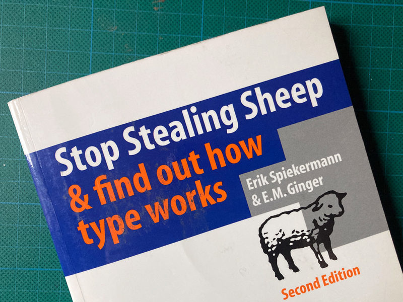
 Stop stealing sheep & find out how type works (2nd ed.)
Saggio
Adobe Press
2003
A stampa
188
Inglese
1993
9780201703399
Indice
Chapter 1: Type is everywhere
Type exists. It is a fundamental part of our lives.
These simple facts are essential to understanding how to communicate more effectively.
Chapter 2: What is type?
Between type's past and its future, our present understanding of type is rooted in who we are and how we communicate. Type is a living entity integrated into society's moods and trends.
Chapter 3: Looking at type
Training the eye to recognize type begins with familiar elements on the page. Looking at both a typeface's basic shape and its finest details is the first step toward understanding how type works.
Chapter 4: Type with a purpose
Choosing typefaces for a particular purpose need not be more intimidating than planning your wardrobe.
Matching an appropriate typeface with the right task is easy.
Chapter 5: Type builds character
Understanding the tone, or feeling, of text is essential in determining what typeface to use, and how it might be arranged on the page.
Chapter 6: Types of type
Basic characteristics of typefaces, once understood, can eliminate difficulty with typeface identification.
Simple distinctions among typefaces are best under-stood by analogy to human counterparts.
Chapter 7: How it works
Legible, readable type depends on a few basic principles: space between individual letters and around words. Choosing the right typeface for the right text also means using the right spacing.
Chapter 8: Putting it to work
Considering where type is going to live and work will determine its effectiveness. Simple rules of placement create practical page layouts.
Chapter 9: There is no bad type
Type is a basic element of communication. As the means of communicating changes, type evolves in unique and lively ways.
Chapter 10: Final form
Bibliography, list of typefaces, index